Cowork/Colive Website Redesign for LOKAL Tbilisi
Before
After
Overview
Context
LOKAL Tbilisi is a businesses that offers coliving and coworking to digital nomads, expats, and locals in Tbilisi, Georgia. After a few years in business, the owner, Candy Treft, recognised the need for a website redesign to more accurately reflect the needs, goals, and values of her business. She enlisted me to accomplish this as well as to improve the website’s user experience and give it a design refresh. I redesigned her website in Figma following UX/UI design strategies and practices and am currently developing the website in WordPress.
Key Values
Community, productivity, inclusion, education, support
Target Audience
Educated, career-minded professional remote workers, 30+ years old, financially stable
Business Goals
Increased cowork and colive bookings
Clearer communication of what to expect for coliving in order to increase bookings and help colivers transition into the community
Better visibility for events in order to increase event turnout
Improved site navigation
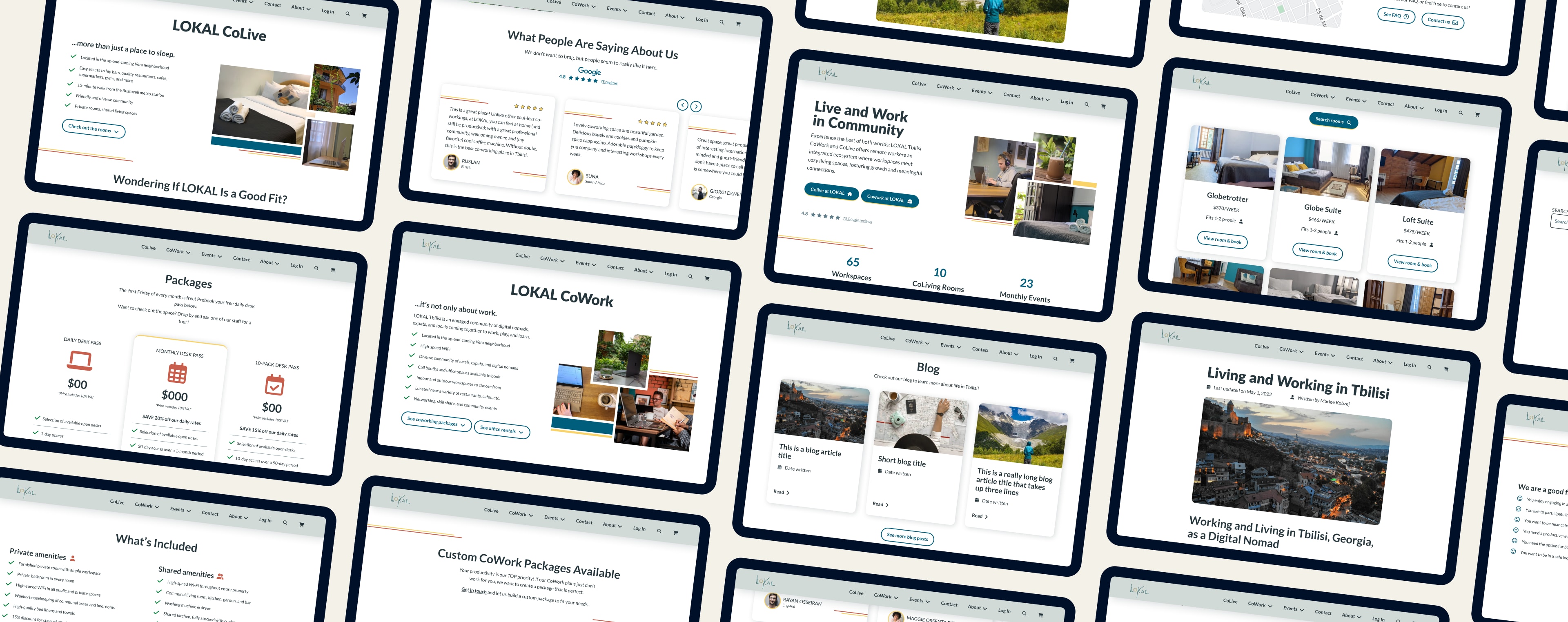
Sample Designs
Home Page: Before
Before beginning the redesign, I met with the owner to determine issues that needed to be addressed. Here are a few key issues that we uncovered:
Broken and inefficient site navigation
Poor colour contrast that does not meet World Content Accessibility Guidelines
Ineffective value proposition in the Heading 1
Hero image at the top of the screen is ineffective because it is low resolution and covered by text
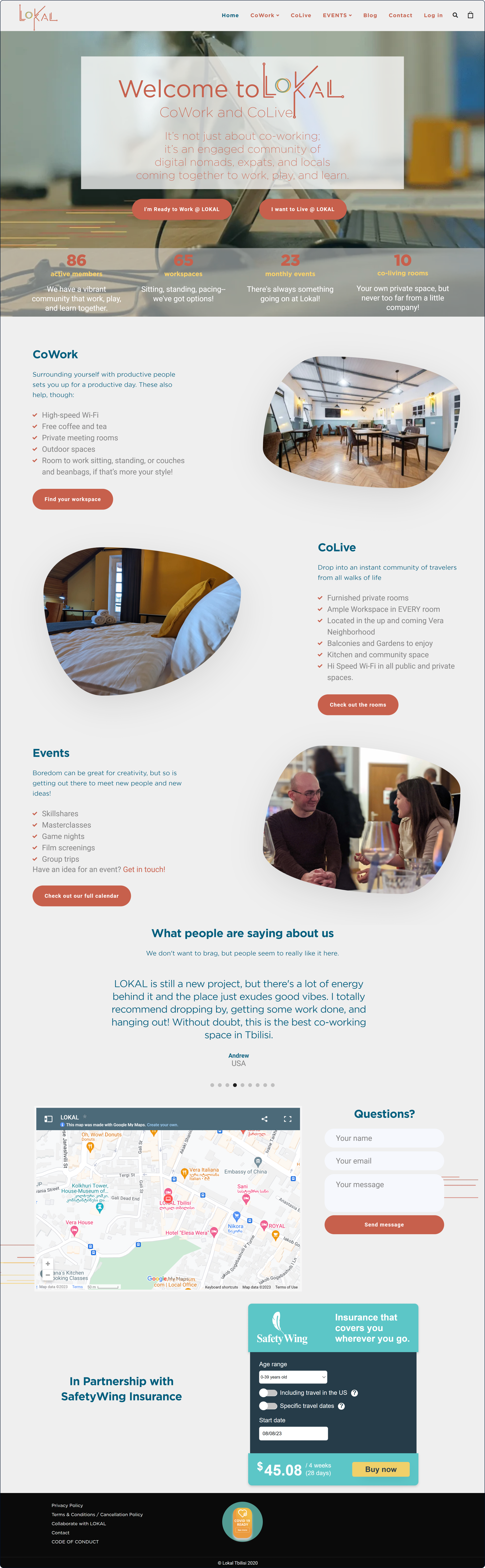
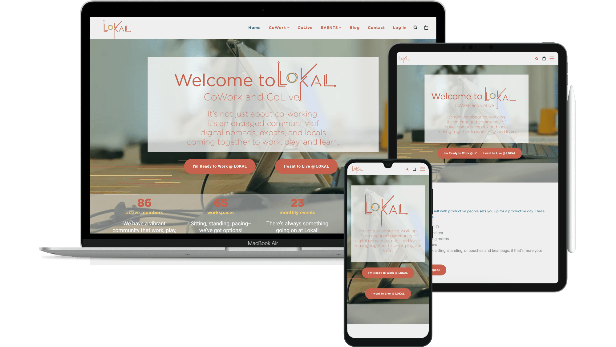
Home Page: After
Some key improvements:
Clear value proposition in the Heading 1 and subheading
More social proof: The Google reviews and “Read About LOKAL Here” logos promote trust in potential customers
Colour updates: I made teal the primary colour instead of orange because it has a higher contrast ratio with white (making it more accessible) and because it is easier on the eyes than attention-grabbing orange
Typography updates: Lato is very legible and has a large number of font weights, which is useful for creating visual hierarchy. The semi-rounded details of the letters give it a feeling of friendliness, which fits well with LOKAL’s emphasis on community.
Note: The owner is working with her photographer to get new photos for the top section of the home page. Some of the ones below are filler photos that will be updated.
CoLive Page: Before
Some key issues:
Walls of text, which users are unlikely to read
Lack of blank space, which makes the design feel cramped
Insufficient colour contrast on the buttons, which may cause problems for users with vision problems or in low-light conditions
Photo gallery shows only private rooms, not any shared spaces
Amenities are hidden under collapsible menus with no clear distinction between private and shared amenities
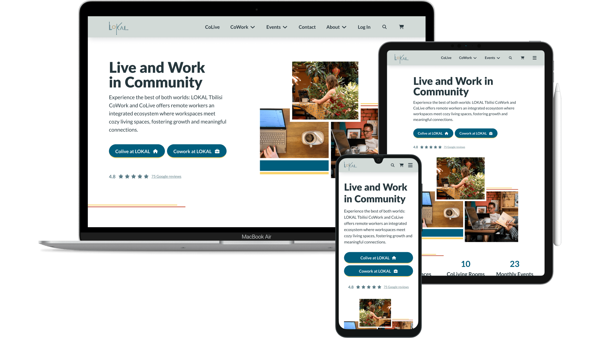
CoLive Page: After
Some key improvements:
Checklists, which users are more likely to read than long paragraphs
A photo gallery that shows the shared living spaces in addition to the private rooms (user interviews revealed that colivers wanted to see these when deciding where to colive)
“Wondering If LOKAL Is a Good Fit?” section to help users understand quickly if this colive is suitable for their needs (content chosen based on user interview responses, the business owner’s desires for who she wants/doesn’t want to attract, and accessibility considerations)
Amenities are easily scannable so that users can determine if LOKAL meets their needs and can compare easily with other colives
CoWork Page: Before
Key issues:
Long paragraphs, which users are unlikely to read
Insufficient colour contrast between the orange text and the grey background, which may cause problems for users with vision problems or in low-light conditions
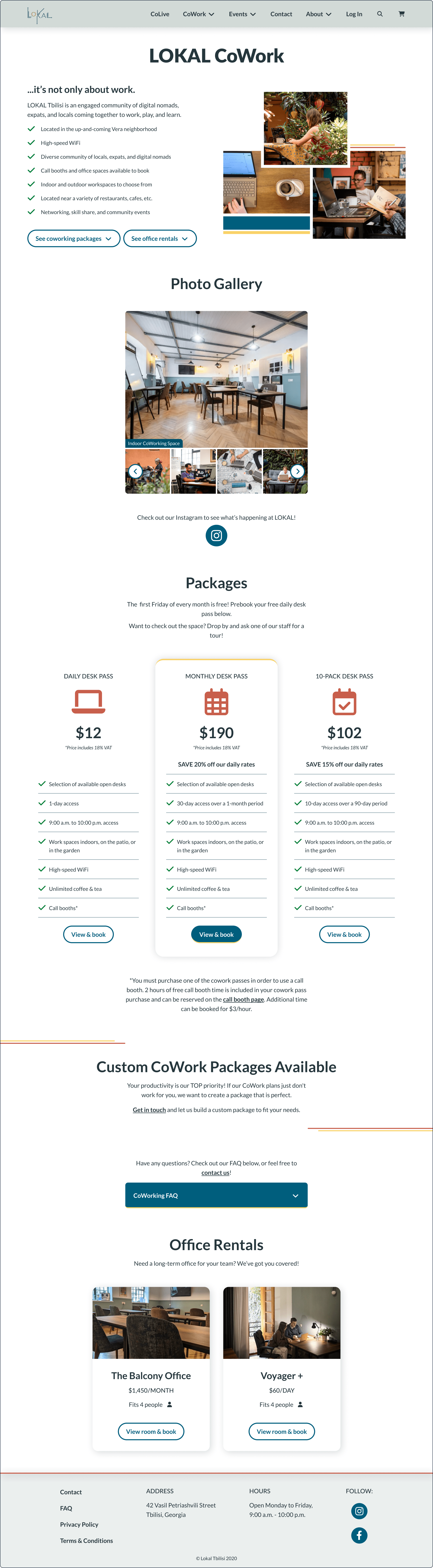
CoWork Page: After
Key improvements:
Checklists, which users are more likely to read than long paragraphs
Sufficient colour contrast on information-bearing elements in alignment with Web Content Accessibility Guidelines
A photo gallery with updated photos of all coworking areas to help potential coworkers determine if LOKAL meets their needs and preferences
Let’s Work Together
Want me to design something for you? Get in touch through my contact form, or book a free discovery call to discuss your goals!