Consulting Website Redesign for All Points Advising
Before
After
Overview
All Points Advising is a company offering administrative and business consulting services to small businesses. They already had a website, but it was in need of a redesign. The owner and manager, April Hartman, enlisted me to redesign the website and make it more accurately reflect the value that she brings to businesses. I supported her in updating the written content, created designs in Figma, and found graphics and updated them with her brand colours. A web developer is currently building the site in Wordpress.
Key Values
Professional, efficient, thorough, practical, easy to work with
Target Audience
Small businesses and non-profits
Sample Designs
Home Page: Before
Before beginning the redesign, I audited the original website to uncover issues to address. Here are a few of the key issues I identified:
Lack of clear communication of the value All Points Advising brings to clients
No clear call to action, which is essential for conversions
Outdated aesthetics, which creates an unprofessional look
No social proof, which is important for gaining potential clients’ trust
Home Page: After
Some key improvements:
Clear value proposition in the Heading 1 and subheading
Clear call to action at the top and bottom of the page and top navigation bar
Social proof in the form of testimonials and certification to win potential clients’ trust
Updated copy to increase conversions
Graphics to create visual interest in the style the client desired, which I found for her and updated with her brand colours
Disclaimer: I worked with the client to update the copy on the website. As a busy consultant, she was short on time and wanted to work on some areas later; in those cases, I created filler copy which may be changed at a later time.
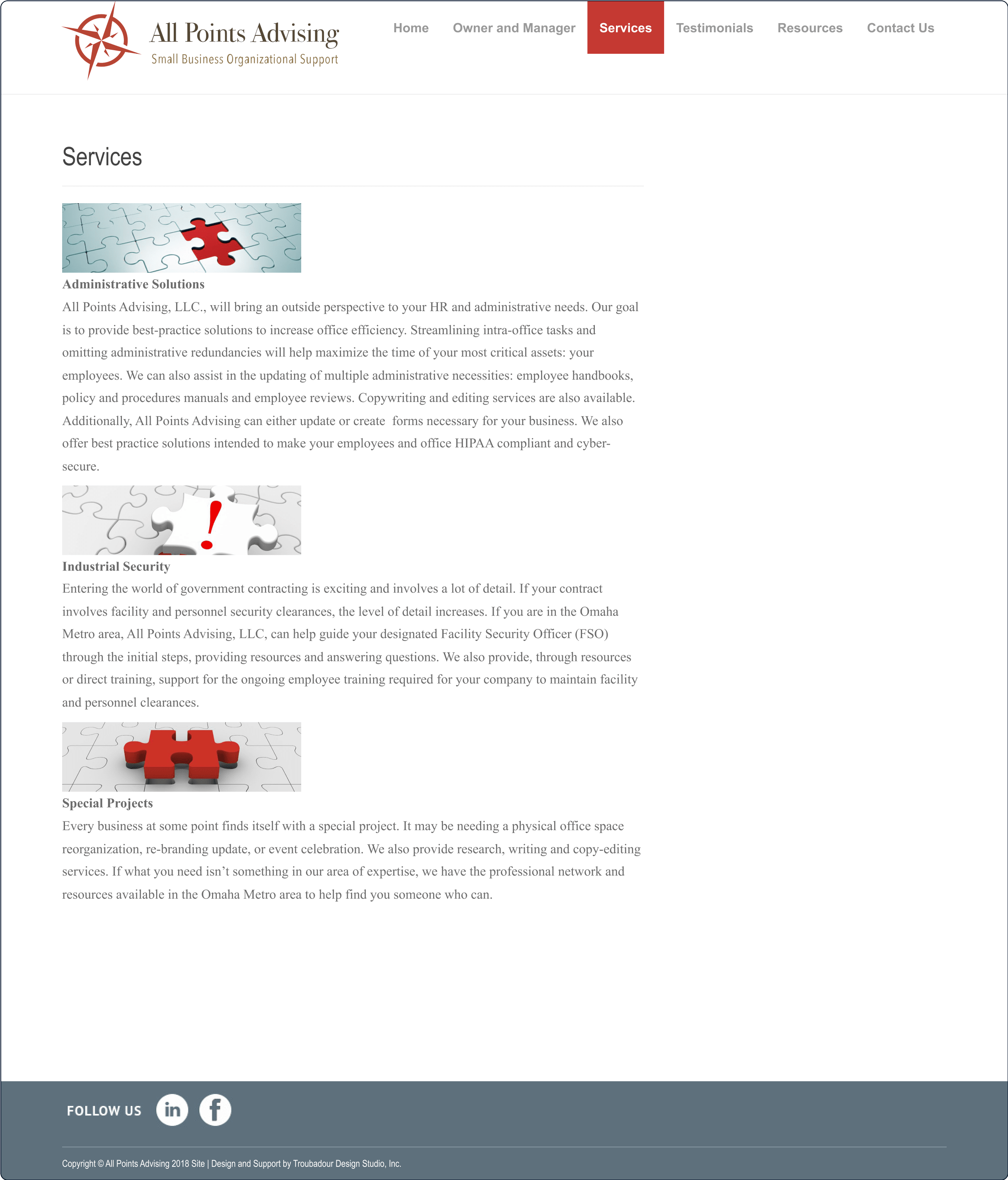
Services Page: Before
Some key issues:
No clear call to action, which can lead to a lower conversion rate
Poor visual hierarchy, which leads to information being harder to process for users
Outdated visuals, which creates an unprofessional feel
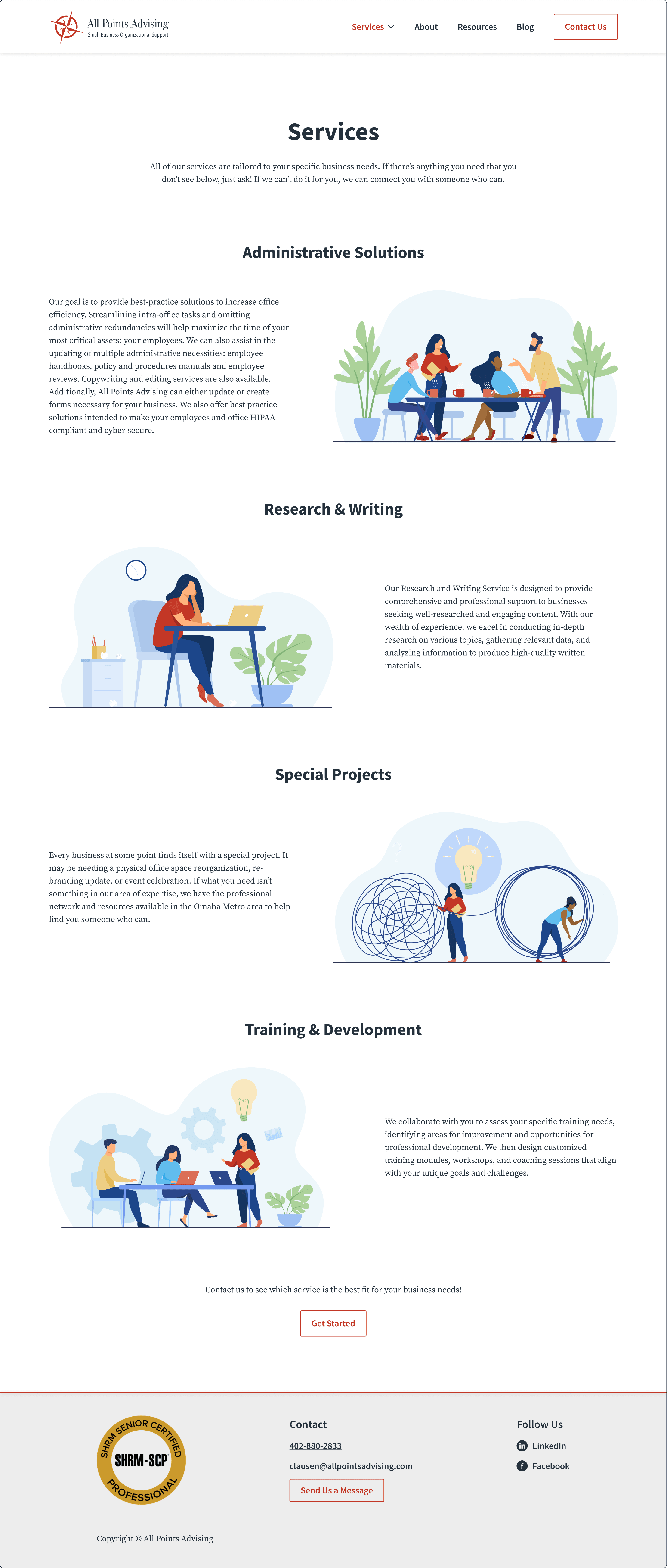
Services Page: After
Some key improvements:
Clear call to action at the bottom of the page in order to increase conversion rate
Improved visual hierarchy, which makes information easier to process for potential clients and improves accessibility
Updated graphics to create visual interest (these are in the style the client desired, which I modified to suit her preferences)
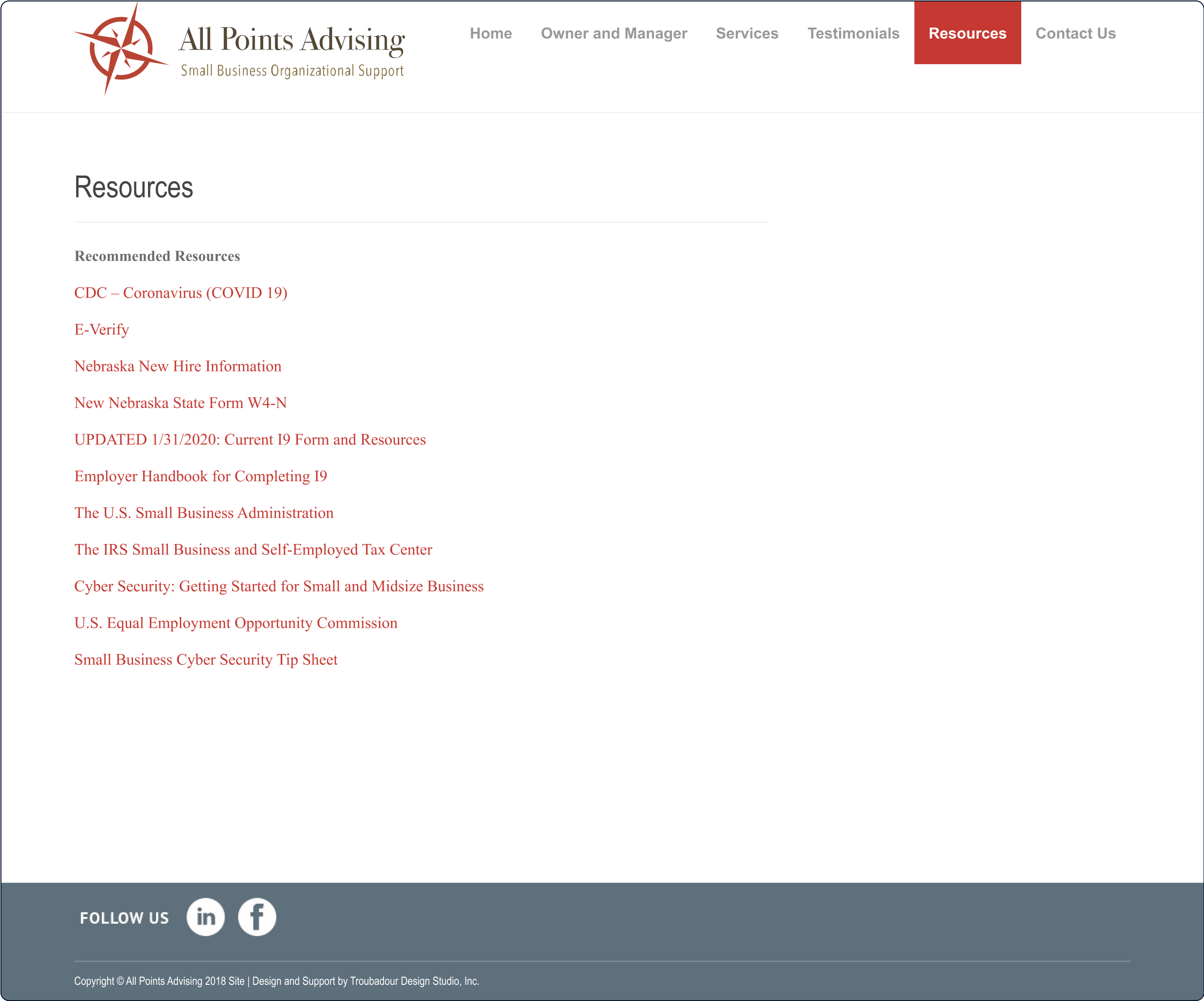
Resources Page: Before
Key issues:
No indication of what the resource is and what will happen when users click a link
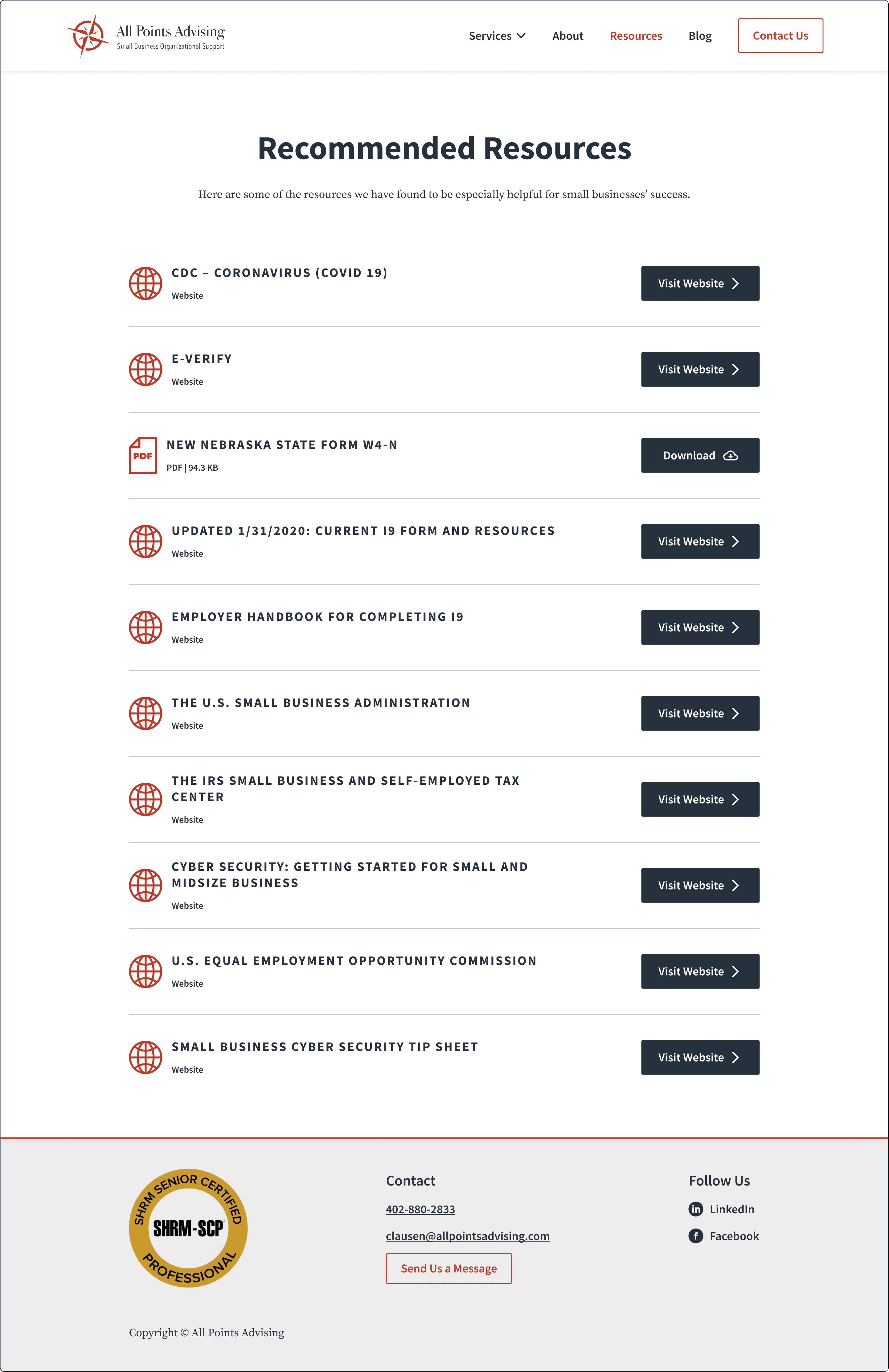
Resources Page: After
Key improvements:
Identification of the type of resource (website or file)
Button with clear indication of what will happen when clicked (opening another website or downloading a file)
Let’s Work Together
Want me to design something for you? Get in touch through my contact form, or book a free discovery call to discuss your goals!